
From Meh to Massive: How Our A/B Test Grew Conversions by 156%

Recently, we ran what might be the laziest redesign in AiSDR history.
We didn’t remove the testimonials or the stat blocks. We just took them out of the hero section. No social proof up top. No polished messaging. Just a blurred product screenshot and a calendar, right at the start.
No design gloss.
It felt almost too simple to work. But it crushed the control.
TLDR:
- Goal: Increase demo bookings without overhauling the product or messaging
- Tactic: Strip the “Book a Demo” page down to a headline, blurred screenshot, and calendar
- Result: 156% lift in conversions (from 6.52% to 16.7%)
A simple A/B test – a tangible uplift
A “Book a Demo” page is always mission-critical for any B2B company.
When it doesn’t convert well, you attack it with fixes that engage people. When it converts well, you always want it to convert even better, which was exactly our case.
With AI being disruptive by nature, you always have to be careful not to disrupt to the point of confusing visitors. That’s why we went with a familiar page experience. It gave us room to introduce a disruptive product during the demo, not before it.
Fast forward two years, and the market is saturated. People are more skeptical, and the nudges that used to work suddenly aren’t as impactful anymore.
This brought us to a total revamp of the hero section and an A/B test.
Hypothesis we tested: If we remove most copy from the page, swap it for a blurred screen, and just keep the calendar, people would be more intrigued and willing to book a meeting with us.
Disclaimer: I was inspired by Tom Orbach’s case on his weird A/B test (and you should seriously give him a follow for unorthodox marketing ideas).
- Variant A (control) was the usual B2B MVP: value props, ROI metrics, logos, social proof, and a clean calendar.
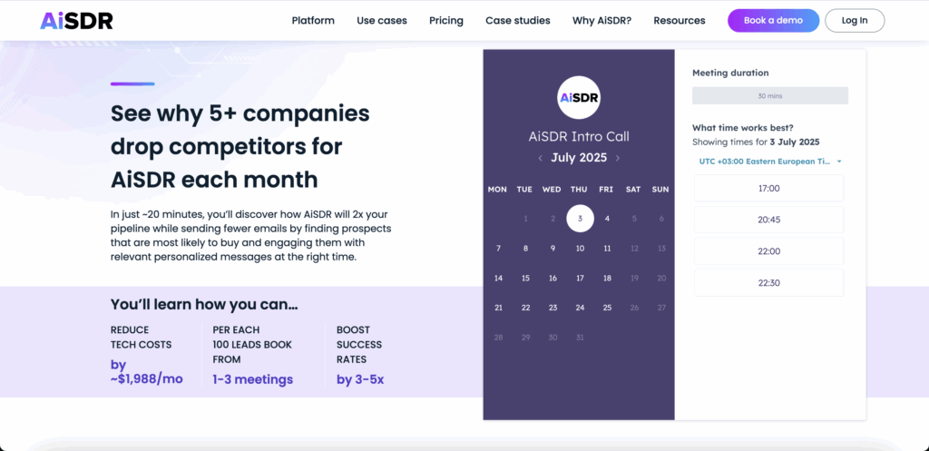
- Variant B (test) had:
→ 1 headline
→ 1 blurred product screenshot
→ 1 calendar.
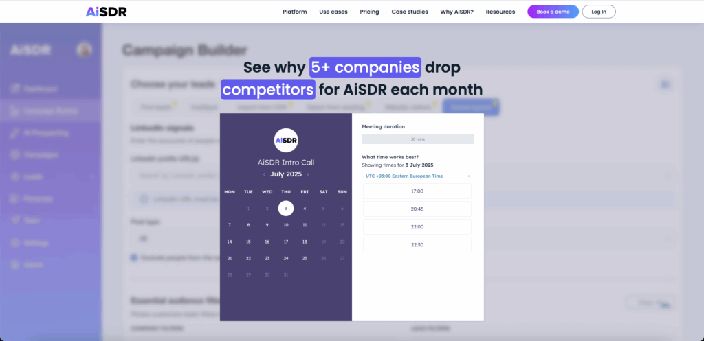
And nothing else.
All the extra social proof was moved onto the second or third page scroll.
The result:
📉 Control: 6.52% conversion
📈 Test: 16.7% conversion
That’s a 156% lift in conversion rate.
No code overhaul, brand refresh, or new features.
Why did it work?
Because choice is cognitive load. Hick’s Law shows that decision time rises as options multiply, a finding replicated for decades in choice-reaction research.
Field data backs it up. In Iyengar & Lepper’s jam study, shoppers presented with 24 flavors bought jam only 3% of the time, while a display of 6 flavors converted at 30%.
Fewer signals. Faster commitment.
But the page didn’t just strip options. It opened an information gap. Loewenstein’s curiosity research shows that when people sense a gap between what they know and what they want to know, motivation spikes to close it.
The blurred screenshot created that itch and guided attention to one place: the calendar.
Tom Orbach put it perfectly: “Sometimes curiosity outperforms clarity.”
Let curiosity carry the funnel
The same principle works beyond demo pages. You can build curiosity into almost any part of your funnel:
- Chatbot pop-ups – ask “Want to see what pricing others negotiated?” but hide the numbers until after the email capture
- Voice notes in outbound – drop a short message like “Saw something in your pipeline data that could 3x replies. Call me back if you’re curious”
- Webinar invites – title it “The slide we can’t publish” and gate the redacted case study behind registration
Sometimes the strongest signal is the one you hold back.
More insights from the AiSDR leadership team:
Subscribe to our Newsletter

How a simple A/B test with one headline and no fluff drove 156% more demo bookings
 Summarize with
 ChatGPT
 Claude
 Perplexity
 Grok
Grok 
 Google AI